True Colours: An Introduction
by Rose-Marie Hillier on 01/05/2014We are born into a world saturated with colour. From autumnal trees to snow-capped mountains, vividly blue lakes to brilliantly hued flowers, nature has set the scene. A world without colour is simply unimaginable.
Of course, now we can have anything and everything in amazing colour, and from iPods to washing machines, colour has exploded into every aspect of our busy lives. So why should we question the colours we choose for our home and do they really matter?
Colour is clever – it has the power to excite, inspire, evoke passion, soothe and satisfy the soul
Colour in the home has very little to do with colour trends; it’s not about what’s hot and what’s not, it’s about how colour makes us feel. Why is it that people are more relaxed in green rooms, feel more protected in blue rooms and overtly passionate (well, some of us anyway!) in red rooms? Put simply, it’s all about the energy in a colour.
How we experience colour… Being part of the electromagnetic spectrum, all colours vibrate with a different wavelength. This vibration, or measure of energy, is absorbed through the body as well as the eyes so that we really do experience the colours around us emotionally and even physically. While some colours are life-enhancing, others will drain our energy or make us feel restless, depressed, even sick.
The need for different colour vibrations or energy varies from person to person, which explains why someone can feel uplifted and happy in a red room, for example, while another becomes overwhelmed and agitated. Most of us feel and behave better with a balanced flow of energy. So if you can’t figure out why a room in your house is not working the way you’d like (or perhaps an individual in your home is not behaving the way you’d like), then maybe it’s time to review the colour choices in your home.
Children are highly sensitive to colour, and will exhibit behaviour in response to the energy they receive from it. Our home fulfils many functions beyond shelter and nurturing; it also reveals and shapes your personality and that of your children. Selecting a colour palette for your home because of how it makes you feel and the way it identifies with your lifestyle is paramount
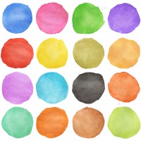
Choosing your ideal colour group… When it comes to considering colours, we generally group colour as it falls on the colour wheel: primaries (blue, red, yellow) followed by secondaries (green, orange, violet), then tertiaries (formed by mixing secondaries with primaries). However, sometimes it may be more relevant to identify a colour group by its temperature, for instance warm colours and cool colours, or its relationship with the landscape, such as earthy colours.
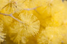
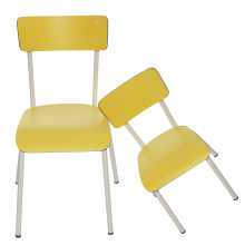
A room painted in warm colours (yellow-based) delivers energy and encourages physical activity – so ‘hot’ colours, such as red, may motivate action in a child; also, time seems to pass more quickly in warm spaces.
At the other end of the spectrum, cool colours (usually blue or grey-based) help mental activities and encourage calmer activity. Shifting beyond the tertiary colours (into shades and tints) can help deliver a more appropriate balance in many situations; for example, burnt-orange or burnt-red in a kitchen is known to prompt appetite, while colours in the lavender spectrum help slow the heart rate in a room where you wish to relax.
Before you select your colours and pick up a paintbrush, consider the mood you want to evoke – is it stimulated, de-stressed, happy, energised, and so on. Balance is crucial. Strive for a colour scheme that balances highs and lows, with contrasts in light, shadow, tones and shades.
Just as an artist uses paint to create mood, you, too, can play with colour to shape your family’s everyday mood
Try to resist the predictable colours, the same old-same old colour combinations ubiquitous in kid’s rooms today. Instead, explore using tints (any colour that’s been whitened), tones (colour with addition of grey) and shades (colour with black). Colour is a hugely useful device when tackling awkward spaces, too. Kids’ bedrooms can be notoriously small, often pokey and sometimes hectic, so if you want to create calm and give the illusion of more space, avoid contrasting colours (those found opposite one another on the colour wheel, such as blue and orange, or red and green).
The True Colours Series… From January 2014, we will be exploring the possibilities of using colour in your home to shape your family’s mood and complement your lifestyle, whether you wish to Stimulate, to Inspire, to Calm, Balance, Comfort or Stabilise. For each mood group, we reveal how colour can be used as a highlight, as an exciting feature, to dominate and define a family or child’s space or in subtle doses as accents.
The True Colours Challenge… We also want you to become part of our True Colours project by challenging you to become your own colour consultant, creating your own personalised Mood Boards, as inspired by each True Colours feature. These will become part of a competition that runs every other month through to the end of 2014, and a shortlist of Mood Boards will then be commented on by interior experts and voted on by MyLittleStyleFile users. The creator of each winning Mood Board will win a selection of up to five of the items they have featured to help transform their Mood Board into a real-life family or children’s room…..
MAY 2014 The Stimulating Colours: Red and Orange. Too hot to handle?

More To See