True Colours: The Stimulating Colours
by Rose-Marie Hillier on 30/05/2014Too hot or not? That’s the dilemma and the appeal of decorating with red and orange – the spectrum’s most lively colours.
Colour is energy and the fact that it has a physical impact on us has been proven time and again in experiments (did you know blind people can even identify colour with their fingertips). It doesn’t seem to matter what colour we think we are looking at, the colour affects us because of its energy entering our bodies. Red and orange have a lot of energy. For some people this energy can have an adverse reaction, while others will openly embrace the stimulation and excitement these colours generate.
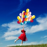
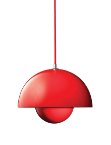
The power of red is undeniable.
It gets the pulse racing, increases respiration and symbolises courage, strength and warmth
Red, pure red is the simplest colour with no subtlety. Yet dilute the intensity by mixing it with white, black or grey and you have glorious variations, like burgundy, ruby, berry and barn red which can add immeasurable depth to a colour scheme.
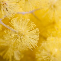
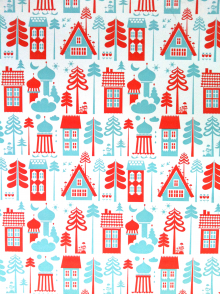
Orange is joyful and the colour of creativity and physical comfort. Since orange combines the energy of red and the happiness of yellow, our reaction to it is both physical and emotional. But beware: orange has very high visibility and gives out the sensation of heat. Temper the tone and you get beautiful shades like terracotta, pumpkin and salmon which are less jarring on the eye and more soothing to the soul.
The emotional connection…
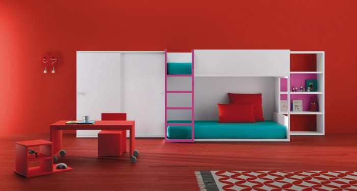
Red is associated with passion, power, desire and love, but it can activate the ‘fight or flight’ instinct, stir aggression and increase restlessness. For this reason, it’s a good idea to take a middle ground when it comes to using red in a child’s bedroom. Instead, use it in areas of the home where you want to encourage movement, such as in a playroom or kitchen. Orange is the colour of food, warmth and security. It’s claimed to stimulate appetite and aids digestion, which makes this colour ideal for dining rooms.
Make it a feature…
Some small rooms benefit from the inner glow of red – though you’d have to be very brave to paint a whole room red. If you’d love to give your child a red feature wall, be sure it’s the wall behind the bed. While red is not ideal as a bedroom colour, because orange is not as aggressive as red, you could be a bit more generous and try this out instead; after all, orange also promotes creativity.
Just for highlights…
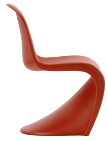
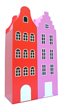
Red and orange are fabulous accent colours in fabrics, bedlinen, painted furniture and accessories. Both colours transcend boundaries and borders – they look as bold and beautiful in modern retro designs as they do in traditional Asian and European patterns. Combine red with green, its complementary colour, and orange with shades of blue to give balance to a scheme. Red brings typography and images to life, so take advantage of red’s power in choosing artworks and framed prints. A ‘statement’ chair upholstered in red or burnt orange is also a brilliant addition.
Everyone has an opinion about red and orange: you either love them or hate them! But whatever people say, they are powerful colours
The True Colours Series… Over the next 12 months, we are exploring the possibilities of using colour in your home to shape your family’s mood and complement your lifestyle, whether you wish to Stimulate, to Inspire, to Calm, Balance, Comfort or Stabilise. For each mood group, we reveal how colour can be used as a highlight, as an exciting feature, to dominate and define a family or child’s space or in subtle doses as accents.
The True Colours Challenge… Become part of our True Colours project by creating your own personalised Mood Board, as inspired by each of the six True Colours features. These Mood Boards will then be eligible for entry into a six part (one for each colour group) competition later this year, with the creator of each winning Mood Board eligible to win a selection of items featured on their Mood Board and turn them into a real-life family room…..
IN JULY The Inspiring Colours: Yellow and Purple
Main Image Photography courtesy of BM Furniture
More To See